Sixteen mockups
The lander I shipped with the day-two MVP was a placeholder. By the time the rest of the system was solid — the load test, the mail rebuild, the deployment overhaul — the homepage was the only piece left that hadn’t gotten serious attention. So I sat down to do the design pass.
I had a hope going in. I’d been impressed enough with what Claude could do across other parts of the project that I figured I’d turn it loose on the design problem the same way: give it wide latitude, ask for lots of variations, and pick what stuck. Color scheme, font selection, page structure, illustrations, copy — all of it. I thought I’d get a wealth of creative options to react to, and I’d hone in from there.
That isn’t really what happened.
The first batch was sixteen mockups. They were technically competent. The HTML was clean, the CSS was tidy, the layouts held together. But they were also samey in ways I hadn’t expected. They were heavy on text. They leaned toward a particular shape of marketing page — hero with a bold tagline, three benefit columns, a “how it works” diagram, a final call-to-action above the fold. And almost every one of them defaulted to a startupy register: pose the user’s problem, sell them on it for a paragraph, position FeedFilters as the solution.
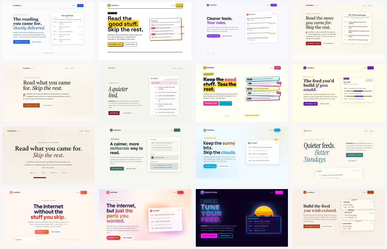
Zoomed in, here’s what one of them looked like:
I get why. The training data is full of startup landing pages, and a startup landing page is a well-defined target. The trouble is that FeedFilters isn’t a startup. It’s a personal project I’m making available because I think it’s useful, and because I want it to exist. The framing I needed wasn’t “here’s how we solve your pain” — it was “I made this thing; if you have the same RSS problem I have, maybe it’ll help you too.” The voice and the visual register are different. Most of the mockups were trying to sell to a stranger. I wanted something that read as a recommendation from another RSS reader.
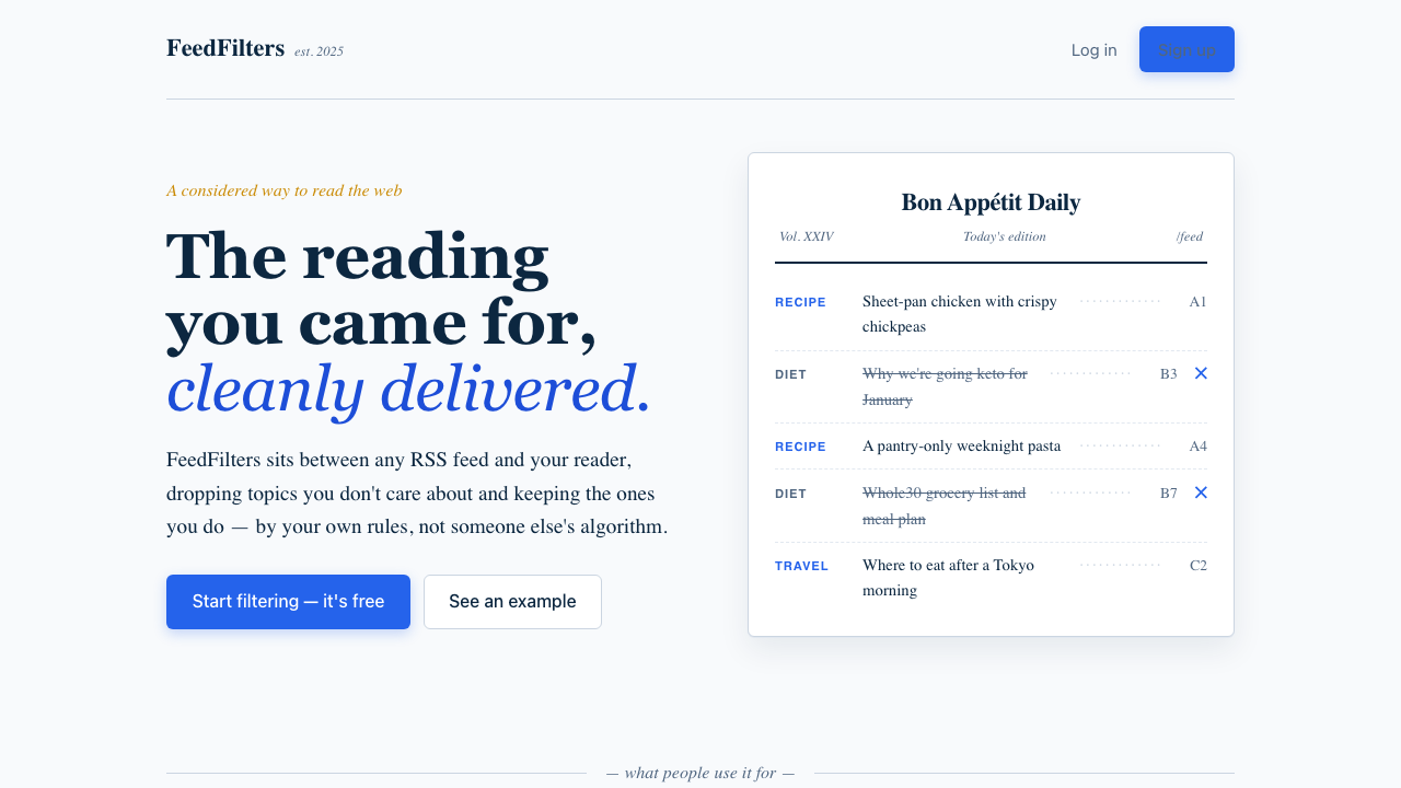
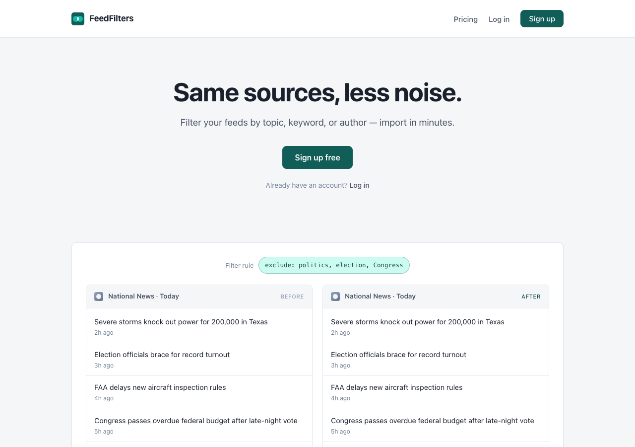
Once I figured that out, I stopped looking at mockups for a while and wrote a positioning doc instead. Tagline, audience, tone, what the page should and shouldn’t do. Same sources, less noise — that became the through-line. Audience: people who already know they have an RSS problem and don’t need to be sold on RSS. Tone: indie, low-key, Pinboard-adjacent. Pricing: free with a soft donation ask, no paywall, no metered tier. With that document in hand, the next round of mockups was much easier to evaluate. A smaller second batch instead of another sixteen, and picking the direction took a five-minute look rather than a slog.
After that, the work was straightforward. The lander shipped, and then the rest of the app needed to catch up to it — admin pages, feed list, settings, authentication flows — which had always been part of the plan.
Walking the templates with Claude to surface where the new palette and button system didn’t apply was efficient: it could enumerate the inconsistencies, and I could decide which ones mattered. Buttons, chips, cards, dark mode — all of that landed cleanly once the direction was settled.
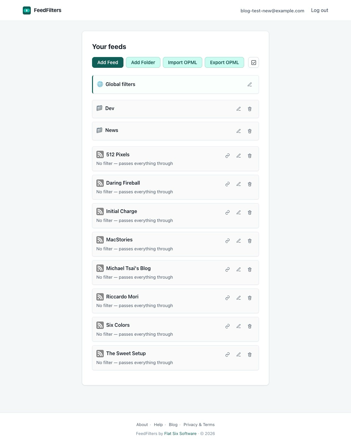
Here’s the feeds list page, before the design pass:
And after:
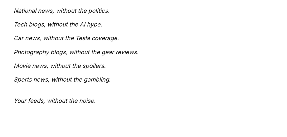
One small detail in the lander captured the dynamic well. The use-cases section is built around a few short phrases in the shape “X, without the Y” — national news, without the politics; tech blogs, without the AI hype; that kind of thing. Claude’s first take was to set them as plain text, one sentence per line, in body type. The words were on the page, but visually they didn’t do anything — they just sat there next to the rest of the body copy.
I asked whether they could appear inside cloud-shape bubbles, the way thought bubbles do in a comic, breaking up the page’s rhythm and letting the phrases read as ideas instead of paragraphs. The result was a noticeable improvement. Same sentences, totally different visual impact.
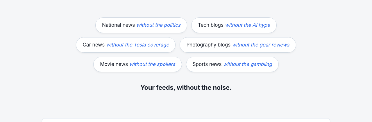
I don’t think I’d have gotten there by asking for another round of mockups; the prompt that led to the better version had to contain the actual idea.
The honest assessment is that this was the part of the project where Claude was the least useful, by some distance. Generating variation cheaply is a real strength, but in design that variation needs an editor with taste, and the AI’s editorial instincts kept pulling toward the trope I didn’t want. Execution, once a direction is locked, is great. Originality and judgment about what fits a non-business indie project is where I had to do the work myself, and where I needed to slow down to do it.
I don’t think this is a permanent ceiling on what AI can do for design. It’s possible another model is better at this kind of work, or that the same model with better prompting would get further. It’s also possible that design in this register is the kind of thing that still genuinely needs a skilled human designer. Where FeedFilters ended up is fine. It’s coherent, it’s mine, it works. But I think the design has room to be much better than it is, and if I ever do a more serious push on the visual side, I’d reach for a person rather than a prompt.